iOS 7: Farben gegen Rahmen
iOS 7 is a decluttering of the most exciting, profitable, desirable
mobileoperating system available. It’s a shift away from artefact, and back to essence. It indicates a clarity of vision, and a continued willingness to pursue simplicity ruthlessly.
Man muss nicht jeder einzelnen Design-Entscheidung zustimmen um zu erkennen, das iOS 7 ein Zukunftssprung ist.
Die größte Aufgabe (und gleichzeitig größte Chance) ruht bis zum Release nun auf den Schultern der iOS-Entwickler. Whisper oder Twitterrific fügen sich schon jetzt visuell gelungen ein; Instapaper oder OmniFocus wirken fremdkörperisch – nicht kaputt, aber altbacken.
I think it’s useful to look at the history of Aqua while thinking about the future of iOS 7. Some designers are saying that the new look is “over the top.” The same thing was said about Aqua over a decade ago. […]
Like with Aqua, these fundamental changes in how things work will stick around for a long time. We may complain about how things look in the short term, but improvements in usability will be something that we value much more in the long term.
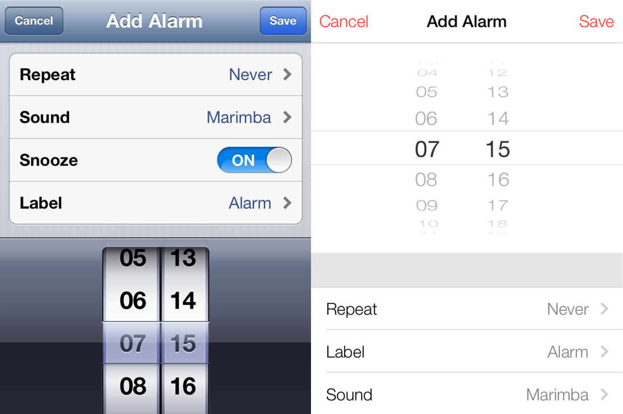
93-Prozent der iOS-Geräte laufen heute unter iOS 6. Auch iOS 7 wird dafür ab Herbst nur wenige Monate brauchen. Der von Apple begonnene Neuanfang ist strukturell, nicht ausschließlich ästhetisch1. Damit wandelt sich das meistbenutzte mobile Betriebssystem erstmals fundamental.
- "Many of the new icons were primarily designed by members of Apple’s marketing and communications department, not the app design teams."