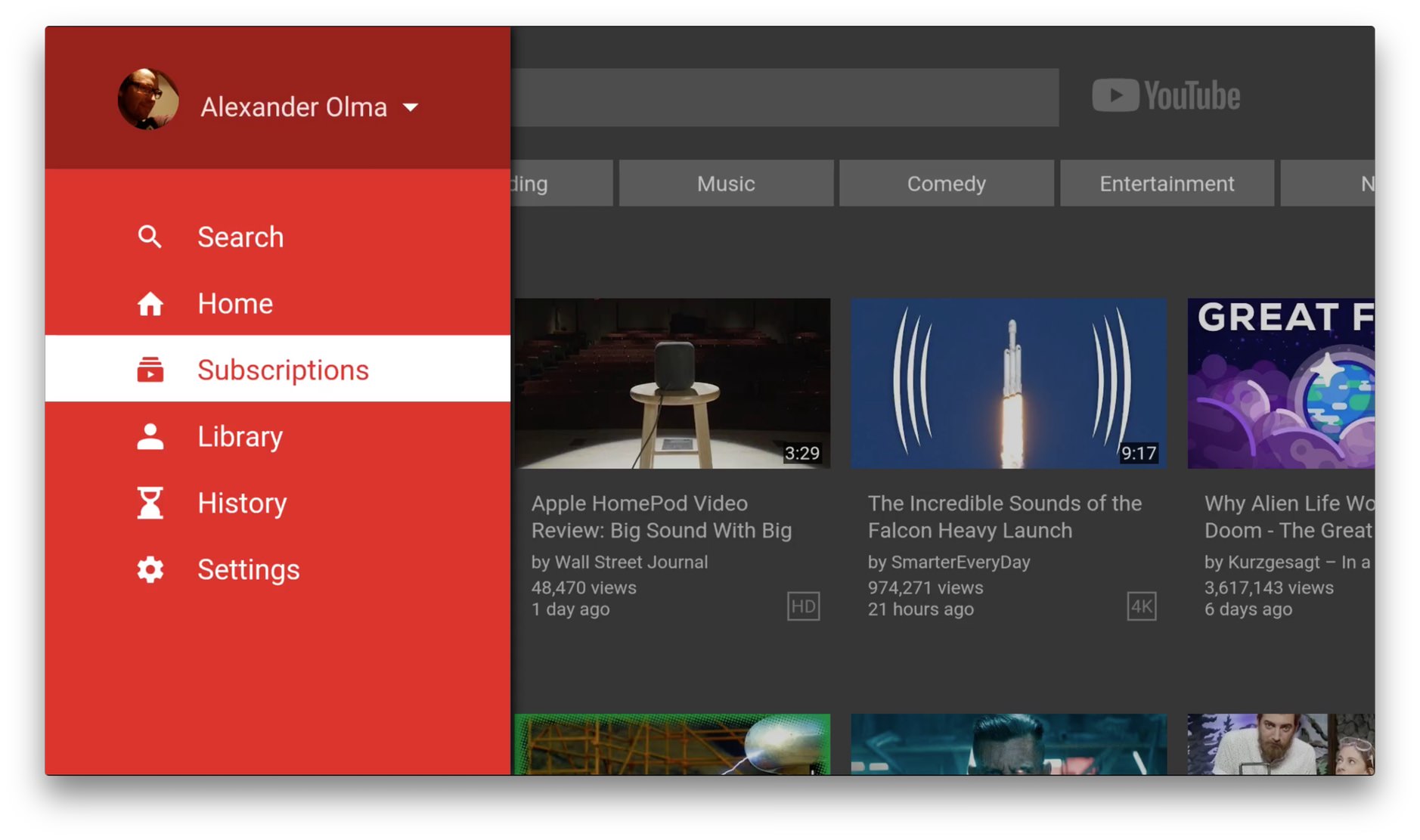
„Reports of Google’s Newfound Design Prowess Have Been Greatly Exaggerated“

Google has become a moderately better citizen on iOS over the past couple of years: their sharing glyph now looks like the system standard one instead of lazily copying the shape they use on Android, for example. This new YouTube app for tvOS is a step back, however. It feels like a half-assed port. When there’s no clear effort by a huge company like Google to even try to make their products fit a different platform, it indicates a lack of care and attention to detail. It also demonstrates that users’ expectations and learned behaviours are less important than self-promotion and branding.
Googles überarbeitete YouTube-App auf dem Apple TV liefert ernsthaft ein schwebendes „Stats for nerds“-Fenster aus, das Informationen wie „Buffer Health“ oder „Dropped Frames“ für das aktuell abspielende Video anzeigt. I can’t even…
Man ist derzeit jedenfalls besser beraten seine YouTube-Videos über AirPlay vom iPhone aus an Apples TV-Box zu schicken.